A great website can be a game-changer for architecture firms, serving as a powerful tool to showcase your portfolio, attract new clients, and build credibility. However, not all websites are created equal, and making common web design mistakes can undermine your firm’s online presence.

This blog explores the pitfalls to avoid and how to ensure your website supports your firm’s goals effectively.
1. Overlooking Mobile Optimization

The Mistake:
Many architecture firms design their websites primarily for desktop users, neglecting mobile optimization. This approach leads to poor user experiences for clients browsing on their phones or tablets.
Why It’s Important:
- Mobile Usage is High: Over 50% of global web traffic comes from mobile devices.
- SEO Impact: Google prioritizes mobile-friendly websites in search rankings.
- First Impressions Matter: A clunky mobile experience can deter potential clients.
Solution:
Invest in responsive web design that adapts seamlessly to different screen sizes. Test your website on various devices to ensure usability across platforms.
2. Slow Loading Speeds

The Mistake:
A slow-loading website frustrates users and increases bounce rates. Large image files or poorly optimized code often cause delays.
Why It’s Important:
- User Retention: Visitors expect pages to load in under 3 seconds.
- Search Rankings: Search engines penalize slow websites.
- Showcasing Work: Clients may leave before seeing your portfolio.
Solution:
Compress images, minimize code, and leverage caching tools to speed up your site. Use tools like Google PageSpeed Insights to monitor and improve performance.
3. Neglecting a Clear Call-to-Action (CTA)

The Mistake:
Some websites lack clear CTAs, leaving visitors unsure of what steps to take next. This reduces lead generation and conversions.
Why It’s Important:
- Guiding Visitors: CTAs direct users to contact forms, portfolios, or consultation requests.
- Increased Engagement: Clear CTAs improve interaction rates.
- Professionalism: A well-placed CTA conveys confidence in your services.
Solution:
Include concise, action-oriented CTAs like “View Our Portfolio,” “Schedule a Consultation,” or “Contact Us Today.” Place them prominently on your homepage and service pages.
4. Failing to Showcase Your Portfolio Effectively
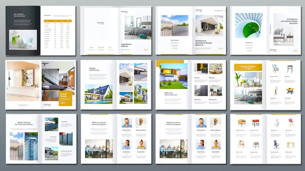
The Mistake:
An architecture firm’s website without a well-organized, visually appealing portfolio misses the mark. Overloading it with low-quality images or failing to update it regularly are common errors.
Why It’s Important:
- Visual Appeal: Architecture clients expect high-quality visuals.
- Credibility: A strong portfolio demonstrates your expertise.
- Client Connection: Seeing your work helps clients envision their projects.
Solution:
Curate your portfolio by highlighting your best projects. Use high-resolution images, provide project details, and categorize them for easy navigation.
5. Ignoring SEO Best Practices

The Mistake:
Focusing only on aesthetics and ignoring SEO (Search Engine Optimization) can make your website invisible to potential clients searching online.
Why It’s Important:
- Organic Traffic: SEO helps your website rank higher on search engines.
- Cost-Effective Marketing: Attract clients without relying solely on paid ads.
- Brand Visibility: Clients searching for architecture services can find you more easily.
Solution:
Incorporate keywords relevant to your services, optimize metadata, and regularly publish blog posts or updates to improve your site’s ranking.
6. Using Complex Navigation
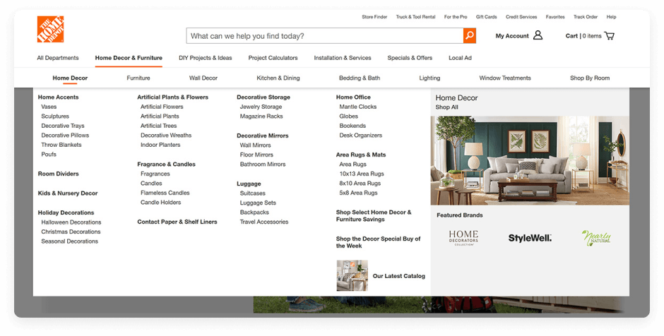
The Mistake:
A cluttered or confusing navigation menu frustrates users and makes it harder for them to find the information they need.
Why It’s Important:
- User Experience: Intuitive navigation keeps visitors on your site longer.
- Accessibility: Simplified menus ensure key pages are easy to find.
- Conversions: Clear navigation encourages actions like inquiries or portfolio views.
Solution:
Limit menu options to essential pages like Home, About, Portfolio, Services, and Contact. Use dropdown menus for additional categories if necessary.
7. Overloading with Text

The Mistake:
Dense paragraphs and overwhelming text walls can deter readers. Clients visiting your site want concise, easy-to-digest information.
Why It’s Important:
- Readability: Short, skimmable content keeps users engaged.
- Visual Appeal: Balanced text and visuals improve the overall experience.
- Clarity: Clear messaging is more persuasive.
Solution:
Break up text with bullet points, headers, and visuals. Write concise, action-oriented copy that aligns with your brand voice.
8. Ignoring Accessibility Standards
The Mistake:
Failing to make your website accessible alienates users with disabilities and limits your audience.
Why It’s Important:
- Inclusivity: Accessibility ensures everyone can engage with your site.
- Legal Compliance: Many regions require websites to meet accessibility standards.
- User Experience: Improved accessibility benefits all visitors.
Solution:
Use alt text for images, ensure proper color contrast, and provide keyboard navigation. Test your site with tools like WAVE or Lighthouse for accessibility compliance.
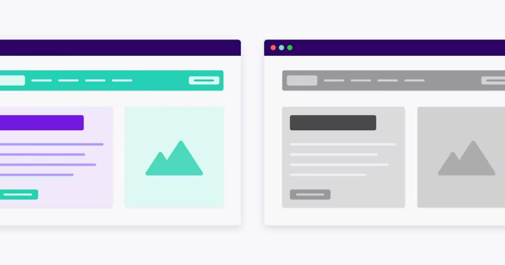
9. Overcomplicating the Design
The Mistake:
Overly complex designs with too many animations, fonts, or colors can distract from your core message and portfolio.
Why It’s Important:
- User Focus: Clean designs highlight your work, not the website itself.
- Loading Speed: Simpler designs tend to load faster.
- Professionalism: A clean aesthetic aligns with architectural precision.
Solution:
Adopt a minimalist design philosophy. Use consistent branding, neutral colors, and streamlined layouts to create an elegant, professional website.
10. Forgetting to Update the Website

The Mistake:
Leaving outdated projects, broken links, or old information on your site signals neglect.
Why It’s Important:
- Client Confidence: An updated site shows you’re active and professional.
- SEO Impact: Fresh content improves rankings.
- Relevance: Highlighting current work keeps your portfolio aligned with trends.
Solution:
Schedule regular updates to your website. Add new projects, update your blog, and check for broken links quarterly.
Conclusion
A well-designed website can be a cornerstone of your architecture firm’s success, but common mistakes can hold you back. By avoiding these pitfalls, you can create a site that attracts clients, builds credibility, and drives growth.
At Sirius ArchiStudios, we specialize in creating high-performing websites tailored for architecture firms. Contact us today to ensure your website stands out, avoids mistakes, and helps your business thrive.